Sunday, December 21, 2014

Zom-B-Q in Hades


I hesitate to even begin where my illustrative career has taken me over this last year?  There's been about as many wig bubbles cold flippin' outah me lid, that I need a lid tapper to come and tap up some of those holes to keep em all up in there!!  I've been teaching Character Design with some fabulously creative Portlandians at the PNCA again this year, and the brilliantly dedicated team of creative directors at Wizards of the Coast.  Both Magic and D&D have given me some absolutely wonderful opportunities, including this painting for the 5E Dungeon Master's Guide.  I brought the painting to class to show students professional practice, and the importance of AD/Illustrator relationships, but after going through the history
©2013 Wizards of the Coast

of the painting, there was still a tiny regret which can visit all professional artists in one way or another.  The fact that; the image and content that you have set in your mind to paint, won't necessarily be the image and content you end up painting.  Simple, selfish, stupid, but rather hard to shake.  I think from being a student myself, throughout my 30's it became less a hinderance, but it's always been a bitter pill?  Emotionally, it's expectation that does it.  The Buddhists & Taoists tell us we should quell expectation of both past and future, by emptying our minds, remaining in the present, concerning ourselves with what Master Yoda explains, "where you are, what you are doing!"

Now this would be easy, were it not for my delinquent 20-something buddy Expectation.  He comes into town from Burning Man unannounced, drinks all my good Scotch Ale, looks at my sketchbook and says to me, "DUDE! This one, is the ONE, this [idea/sketch/composition/specific or complex aesthetic] is AWESOME!  You should do that!!  You gotta %@king do that!!  You should be so proud of that, and get attached to it like it was your child, man.. or your favorite shirt you refuse to throw away.. or an adorable little kitten, or something..!!"  My normal reply being, "You're a completely reckless @!ck-weed, you owe me money and years of my life, but YOU ARE SO RIGHT!" ..and so the stubborn anchor of disappointment takes foot.. =)

©2013 Wizards of the Coast
I love the fact that most of the ADs I've worked with at Wizards have given me a fairly long leash when it comes to ideation and briefs, as was the case with this piece as well.  It's really a luxury I've not seen in other markets, who really don't have half as many specifics to contend with, so I'm wildly grateful.  At the beginning of this project, the brief was just that open, a Lich using a crystal ball, and since I worked on concepting a couple Lich characters, I pitched two thumbnails with those characters, and the 2nd Edition illos of Michael Kaluta and Wayne Reynolds in mind; One human male Lich in a lab with gilded Frankensteinish, bubbling tubed canisters surrounding his crystal ballishness, and one being a Tiefling female in Hades using the crystal ball, (as you do) surrounded by a horde of black robed Witchy Hags who were holding squirming worm larvae.  Oh yes, the sweet smell of baking larvae in Hades!

Now it's at this point, while I was waiting for approval, that my buddy Expectation lost his blinkered mind about the sheer and utter grossness of the gooey cool hued larvae, contrasted by both the dark robes, and all those reds and oranges from the pits of Hades!?! "DUDE, they gotta dig it !!!.. It's the most evil and disgusting image that's ever crawled up the sides of your skull!!"  I fully agreed, and even worked up a couple color schemes so the hot gamut of all those reds would print correctly.  Well, they did end up picking the Tiefling female in Hades, but as is sometimes the case, a revision was called at the 11th hour.   I was bitten by my old buddy again, wanting that horde of witches so badly, any revision seemed silly, but there was something that sated my buddy Expectation's rattling, as what was going to replace the witches were bloody Zombies !!  So, my inner 15 year old, who is over joyed to still be working on this kind of imagery no matter the revisions, gave Expectation a couple concessionary pats on the back, booted his deadbeat arse out the door, and I stepped to painting zombies.. =)

After living through this process with me (and liking the zombies a bit better I think) my brilliant Partner deemed this one, Zom-B-Q in Hades.  I'll toast a couple buns for ayebody, grab a copy of the brand new 5E Dungeon Master's Guide, and enjoy!

©2013 Wizards of the Coast

Labels: , , , , , ,

Wednesday, June 26, 2013

First Class Grads

As I said in my last post, I miss teaching.  To see a bit of your experience somehow transmogrify even one student, is a gift worth the sleepless nights prepping for the next class, while miraculously working freelance gigs in the time between.  Most of these graduates I had in my initial drawing materials class, or my painting class of which a taught and critiqued from Richard Gregory's Eye and Brain.  I don't want to belabour specifics, but being witness to this group of students, grow their skill sets in the 2 years I worked with them, is something unforgettable.. =)

Art Directors, Editors, and Scouts that I share this post with, there are some extraordinary talents in this group, so please take a couple minutes to check out their wonderful work. =)

Graduates, I know I'm missing some folks so forgive me, or send me your links and I'll update the post, but remember even though I'm nae currently the owner of a mailbox at the school, I'll always be willing to advance your career in any way I can.. =)  Congratulations!!  Illustrare' - Bring it to LIGHT !

A couple of the promo prints for the thesis
presentations I attended last Focus Week.

Mattew Newton - Matty recently landed the cover of the Portland Mercury, has a wonderfully specific  style, and I can't wait to see him bring his Light to the editorial scene. New Yorker, look out.!

Ona Zelda Pitschka - Ona's thesis took on the difficult task of unifying Science and Mythos through a series of brilliant illustrations.  Beautiful sense of design and metaphor, Ona has also been awarded by the SoI student show.
http://violentcosmos.com

Liliya Dru - Lovley line and pattern, Lily also has a clear sense of environmentalism and feminine Goddess culture in her work.
http://thegreenwoman.tumblr.com/

Samantha Mash - Samantha's ghostly illustrations done for her thesis were superb.  Samantha's figurative skills, and high contrasted silhouette are simply beyond her years. She was also awarded by the SoI student exhibition.

Matthew Seely - Matthew is a talented animator, with a mad sense of humor.  His animated short Margaret can be found on his website.

Katie Newman - Katie is an aspiring concept artist, who's thesis was somewhat reminiscent of Barlow's Expedition.  Wonderful to see her skill set is developing into creature and character sets all her own.

Anne Ferguson - Anne has a beautifully thoughtful editorial style developing, with an excellent sense of design and metaphor.
aefergart.tumblr.com

Seanavin Scar Egdamin - Sean is an energetic graphic illustrator, with a beautiful sense of shape, and typography.  Sean's thesis was based in themes of Hawaii, and support of it's indigenous roots.
http://projectehui.tumblr.com/

Niki Buckno - Great socio-politico commentary on chain-mail bikinis, and wicked inking and comic chops, Niki has always had a great sense of facial expression.
http://nikibuckno.weebly.com/
http://nikibuckno.wordpress.com/

Jeff Versoi - Budding narrative and comic chops,
Jeff has also been awarded by the SoI Student show.
Jeffversoiillustration.tumblr.com

Hannah McLain - Coming from a background in Tattooing, Hannah's thesis was series of illustrations based on the writing of Tanith Lee. A true eclectic Portlander.

Stay tuned..
Chuck

Friday, May 17, 2013

Forging Games :: Part I


On finishing any big project, it's remarkably easy to kick back, become one with the closest comfy chair and watch period detective series'  for hours.. or weeks.. But as any freelancer will tell you, the time you can take to rest on your accomplishments is usually no time at all.  While you were working quite diligently on the biggest looming deadline, the host of; meetings, promised work for friends, personal work, and all the focused self-promo to carve your way into the next big project, sit smoldering there in the corner, bent up and in states of neglect.

To my amazement, (and thankfulness, as I didn't teach one class) the whole of last year was miraculously filled back to back, with nothing but big projects, and I rode the awesome wave, just hoping that all that other opportunity didnae stick me hand in warm water while I was sleeping!  Opportunity is tricky that way. =)

The Warden in all her 3D modeled
and action packed glory, not your
run of the mill tank character.
One of those big projects came in the way of an email from; wildly skilled digital illustrator and visual problem solver, Adam Cook, and the wickedly brilliant and fun team of creatives at SuperGenius (additional links to your right).  Adam brought me on board Paul Culp's do-all video production house in Oregon City, SuperGenius just around this time last year.  Can't really describe the honor it was to work on the design and concept team for their video game Forge.  It had been a long time since I worked on any team, let alone one with so many Super Geniuses (Genii? Geniui? Genieye?Gene Kelly? I dream ah Genie?) but the results have been double down rainbow in the sky, all the way; working on my World Development skills, Characterization, the slow but interesting progression of my Digital Chops, and above all, being a visible and solid part of FORGE; a brilliantly fast paced and fun game that is now out on the Steam game engine, using some of the very latest in animation and visual tech.  It's a bloody romp of hack, slash, and arrow nocking melee strategy, with massive fiery explosions, and magical burst of mayhem stashed away in every corner.  For the sake of your inner-viking I would defo check it out!! =)

The Warden's Bear and Ranger's Wolf.  Belly tattoos, shaved knot
work, spinal and tusky protrusions, and bands of forged armor. 

I'm pretty proud of the work I did, and what seems fairly unlike a large majority of gaming studios; Dark Vale, Digital Confectioners, and Super Genius gave all Forge's concept artists the ability to show this work shortly after release, so here it comes my friends, in a three part series!

Final Bear Modeled
The Warden character was Forge's "tank" character and from the beginning she was to be something of an anomaly in the video game status quo.  I can only hope that we were able to do so in even a small way.  The Warden character was a task in balancing strength, body type, posturing, costuming and the myriad other things that make up the tank, while still having her remain feminized enough to read as such on screen.  Her shield took on many different shapes and forms, as did her helm and weapon, but the final 3D models took on all the right elements, while remaining in the ancient Nordic period we were after.  The weapons I designed for the Warden were especially fun, and although I only really had time to design out the top half of the shield, the Warden's shield attack features a ring of shields lit up something like golden lanterns!! just beautiful to watch, and brilliant to see some of my imagery make it to game play!

Final Wolf Modeled
The idea of familiars or spirit animals for each character was being tossed around throughout all waves of development, and here I had the chance to develop some fun ideas that were developed further as the initial 2 weeks were drawing to a close.  The Warden's familiar was to be a Bear, as was the Ranger character's to be a Wolf. The Thief/Assassin's familiar was to be a Panther, and the others were to become awesome ghostly and pyropocolyptic beasties


The Ranger character began when I didn't really have a great grasp on how some of the aspects of modeling and animations would actually play out, or the process that was to be followed.  Portions of his costume, and the blue lit Celtic cross chest plate remained, but the Ranger character gained largely from a couple different folks joining in on design.  The Ranger did help me understand how being ignorant to portions of any process might be a blessing in coming up with combinations that wouldn't be attempted, but also how they remain a curse.  Perhaps one of the greatest lessons I learned throughout Forge, was that very few of the tricks illustrators use to direct the viewers attention two dimensionally, actually apply when designing for games or film, where it's all about the 3D all day.  Thinking about function and mobility in real time 3D while you work, is utterly different than thinking about the very same things as they're required for only a split second in time.  =)  I'd like to think by the time I finished the last character I designed for Forge, that I had a better handle on the specific hassles any particular material, or body part, or structure might pose, because of the growing pains in the first character.  =)

 Fun to see all the ways in which simple shapes, or the mention of words during the ideation process can effect outcomes, it's just an amazing thing to take part in, and much like the free association or improvisation that happens when I use Fantasy Genesis, so was working with such a creative team of folks.  Stay Tuned for Part II !!

Labels: , , ,

Wednesday, May 15, 2013

Portland Grand Prix


What a great event!!  The Con Center was packed with Magic the Gathering players, and the front line of illustrators were the likes I've nae seen!!  RK Post websiteMark Tedin website, Anson Maddocks, Mike Dringenberg, Steve Argyle websiteMike Daarken Lim website, and myself; sketched, signed, told lightpushing tales of old and new, and otherwise sold our artistic souls to the fans of the greatest collectible card game done placed on this here spinnin' Sphere!

One of the highlights of the show was having a great dinner with fellow LightPushers Mike Daarken Lim, and his wife Kat.  Daarken is of course a name synonymous with most brands at Wizards, and a long list of publishers and vid game companies, but in my research for an upcoming interview, I also found all the brillos work Mike has been doing in the form of tutorials & reviews on his Enlighten site. Quite an artist, and I can't wait for the chat!

Sad to see her go, but Barrington Forge Tender is sold and off to a new home!
I had the great fortune of selling the original painting for the Barrington Forge Tender during the Grand Prix as well..  There was an interest at the show, I started a haggle that I would've followed through with, if there was a decent offer, but in the 11th hour when I got home for the night, an email collector snatched it oop!!  Crazy timing on that one.  I've used BFT at school as an example of professional process, at shows as an example of the multi-layered wash technique and how an original glows in ways a print simply cannot, and at home this painting has been off and on my walls in both Detroit, as it has been in my apartments in Portland for the last 7 years.  After all that, I'm torn, but I'm also happy that the BFT will be framed up and enjoyed, instead of stuffed away in the closet as well.. =) Cue Sting..


The best part of any Magic show is sketching and sharpie markering up cards and playmats with weird and fun alterations, and this show was no different.  It was every bit as weird and wonderful as the last, and like the theory behind Fantasy Genesis, the most creative wig bubbles seem to come from limiting yourself to only one or two words in association. After all you don't want your skeletal robots getting too complicated on you, nor should you give too many fans playmats crabs.. =)

One of the many highlights of Portland
GP, was giving a fans playmat crabs.. =)
Now it's straight on to the Grand Prix Las Vegas in June, and a whee further bit on to the new Theros World dropping in Sept.!! Stay Tuned !!

Tuesday, January 22, 2013

One for the Dream


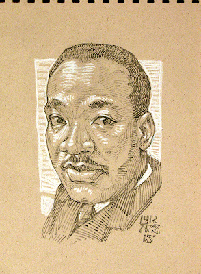
Thought I'd sketch a small portrait of Dr. Martin Luther King for King Day this year, and posted it on FB.  It was nice to get some response, but what seemed to be present in my mind, was how much MLK accomplished before he was cut short of becoming 40?  While listening to Peter Werbe's Nightcall today, I was reminded that Dr. King was just 26 when he first started to address folks around the Nation about Civil Rights, and form a following of millions to support something that, to folks in power, seemed even more dangerous than the growing Military Industrial Complex?  From 26 years old, to 39?  How very few of us in the field of Illustration have the skill set, consistency, or opportunity to start the largest portion of our careers, at such a young age let alone have anywhere near the social impact?  Perhaps since I've sold a couple paintings in the last couple months, and it's making me look back at what kind of work (if anything) will be my "legacy" when I snuff it? Perhaps I just can't seem to fathom the strength of this man, and the brevity at which he was able to sway so many minds toward compassion and Unity?  I've been lucky enough to inspire some students, and create an art tutorial book, and that's more than I ever expected at some points in my life.. but at 42, I sure as sap hav'nae Unified a Nation almost single handedly!?!  =)

All of my heroes have some flaws, and MLK wasn't without his own, but having such an impact within 13 years of his short life, is immeasurable and something we all should cherish!

The Content of One's Character


Saw the trailer for Pacific Rim at the cinema when Pam and I saw The Hobbit the other night, and I was reminded of how successful; snub-nose, truncated, foreword sloping Cro Magnon facial features can be when used to indicate insane strength and behemoth scale in any characterization.  The first couple of times I was really impressed with this, were with the Dragons of Michael PhillippiPaul Bonner, and Todd Lockwood.  
All three of these brilliant illustrators create amazingly meaty creature heads, by giving them small but detailed orbits, and a brow to jaw line with only one or two surface planes to it. The unconscious mind will read this as a skull structure so dense and solid, that any attack will surely just recoil from the weight.  There's many other ways to achieve this, but for giant creatures, it's a great technique, and works every time.

After seeing the trailer, I remembered this sketch floating around on the sketchbook I used in my classes at the PNCA.  Done from the Fantasy Genesis role to the left, and revisited on more than one occasion, I thought I'd have another go at this Triceratops Rhino looking fella.  I threw some more masculinization into the pose and facial features, but also shrunk his head by giving him bigger limb proportions.

Another double Mammalian role that took a couple tries, but could make a nice protagonist or antagonist when he grows up?  Keep sketching, and stay tuned !!

Tuesday, June 05, 2012

Grimm Pilot - take two

Life goes by so quickly sometimes, I shiver with the thought of it.?  This small bit of work I did for the pilot of Grimm unfortunately didn't see too much screen time, but here's the rest of the story..  The show's been through a whole season, and picked up for another, but I've been so busy with teaching and freelance, moving my studio again, and acclimating to a new work flow, I've been completely delinquent in watching it..  Perhaps I can have a marathon when the new season starts and catch up on all the episodes missed?

©NBC/Universal
In any case, my students love the show, and every episode I've seen has been proper acting, and fast but extraordinarily creative effects and props.  Before I went into the Grimm lot studio to work, Elisabeth had me do a couple treatments of the directors chair logo (shown previously), and a couple sketches for pages what would appear in the book.  I was super geeked about this potential, as being the "guy who sketched the Grimm book" would've been the newest height of this thing I call a career?  Not having seen the graphics for any monsters, and going off the ideas of the show that were given to me,  I sketched these two characterizations; one of Rumpelstiltskin, and one of the Old Crone of Hansel & Gretel fame.  
©NBC/Universal
 The Crone character was actually in the pilot script and described to me a bit, but the Rumpelstiltskin was basically me spit-balling some ideas of how the mythos could be delivered in a new horrible way.  Then after my first day, I got a look at the script, a better idea of what they wanted, and they had me sketch up a couple mock ups of what the pages of the book might look like.. The script at the time said the book should be a sketched archive of the 2-3 monsters that would appear in the pilot; Wolf, Snake Guy, and Crone, wherein one page would be a likeness of the person in human form with something like a police form attached; stats, criminal encounters, notes, etc., and the other would be a likeness of the beast within, and what they look like to the Grimm. At first I thought this was something that, over the ages the Grimm Family would've developed, or perhaps a universal system of documenting in some way, where pages from 100 years ago, might look something like they did for the grandmother Grimm, but this changed, and a couple times. The nature of television perhaps.. =)

©NBC/Universal
©NBC/Universal
The book was a massive tome, so I did my samples actual size but in graphite at first. These two samples, with all the different "hands" of nonsense filler script I could think of, were shown to the director, and although the smoking guy was closer to what they wanted, the direction quickly started to change into a scrawled "untrained" hand and more primitive skills, rather than my "too illustrated" "too good" work.. So that day I tried my best to dumb down my skills, and perform on command, with the already "aged" paper they'd ordered for the book.  Bringing in thicker tools; pens, brush markers, graphite sticks, charcoal, conte' and fixative, I sketched about 6-10 sheets of characters, scrawled script and in every different way possible.

©NBC/Universal
I remember a beaked character with hooks, that turned out looking quite 40's nazi-ish, an orge, also this Blutbad in conte' that looked older, matching the paper quite nicely, but also the two portraits of a Blutbad, and Crone straight from the 3D models the design team had done at that point.  Neither made their way on to the screen, even after limiting myself to 10min. sketches, and really working at aping a less skilled approach.  Alas, I've not seen any of them appear in the pilot or show so far, and didn't get phone pics of them either.

Funny thing, being inadequate for anything you're truly geeked about, jobs, relationships, or otherwise.. but when what's needed is, loosing your skills and not developing new ones, it's especially odd?  I was basically trying to reverse my skill set, desperately scrawling to give them what I was used to doing when I was 12?  Hell, I probably didn't do an "untrained" look when I was 12?  I even tried sketching with my opposite hand, in a balled fist, and I couldn't imagine having my name attached to it, even if it was what they wanted? So, could be a blessing, could be a curse.?  I've a pretty impressive new client on my client list, and with some luck this won't be the last television has seen on this Lightpusher.. =)  Stay tuned !!

Labels: , , , , ,

Monday, May 21, 2012

My Three Mentorships


I've found in the brief time I've been teaching, that the best stuff comes from individualized one-on-one tutoring.. When I can get straight to clearing a pathway to where that particular student wants to tread, and see almost instantaneous success in the areas they want to work on, I know I've done a decent job of it.. There are few things more awesome and striking than these wonderful instances, and I had the rare opportunity to serve in this way to three great 4th year thesis students this semester; Ven LocklearLey Hazard, and Addison Rankin.  I'm extraordinarily proud of all these young illustrators, and would encourage Editors and Art Directors to take a look at their work to see if they might fit any projects or internships on the horizon..


Ven (with a Fae picking his ear), myself, and Addison (with tiny staffs and arms protruding from our heads)

Addison Rankin is a digital painter, with about the most pleasant and agreeable personality that you're going to find, and with a skill set that's far outside his age.  His digital work holds an almost Flemish feel to the lighting and contrast, and his B&W ink drawings are brilliantly alive, filled with spastic movement, intriguing costumes and characterizations..  Addison's thesis was based on creating eight portfolio pieces for a Sword & Sorcery themed Tarot deck, and his presentation followed Uncle Joe Campbell's Hero's journey from the Fool card's perspective..  After seeing all the traditional and digital painting from the school recently, I can say the work done for his cards, stands as some of the best figurative work out of every department of the school, and is at a state of finish to begin competing in the SF&F market.. Definitely keep an eye out for Addison Rankin on your journeys, and give him a holler at his website if an opportunity or two arise..


Ley Hazard is a conciliatory, but wickedly skilled digital illustrator/comic artist.  Filled with articulate surprises, and gravitating toward serendipitous creative spurts, her work is quite meticulous and shows brilliant promise in being very tight in it's line quality, and expressive in it's characterizations and metaphor..  When she brings her work to the Light, it shines with a thoughtful polish that's well worth the wait..  Hazard's thesis was a pitch for a graphic novel series called, The Catastrophe Quartet..  The stage is set here in Portland, in a simultaneously real and fantasy world, that follows the heroine through personal tragedies, her redemption through compassion, and eventual elevation from it..  Do yourself a favor, bookmark and stay tuned to her Catastrophe Quartet Blog to see how the story and illustrations develop into the first book in this emotionally and socially charged series!

Ven Locklear, out of all my first mentorships this semester, has landed a gig in his chosen field, straight out of the gate!  I needn't really go on beyond that success so few folks in this business attain, but I will.. =)  I had Ven for an Independent Studies student a semester before last, guided him through some figurative struggles, and when chosen to be his mentor, tried to impart all the knowledge I've accumulated in terms of design and color, but also characterization and creature design..  Quite early on, he was asking the same questions I'd been long ago, curious and driven by our common genre', visually progressing from week to week, which is an amazing thing to behold with any student.. When he pitched his idea for a SciFi horror themed vid game called GLOOM, I thought; this work would make a great portfolio to pitch around conventions, enter into contests, and really grab a heads-up in terms of a freelance career, but little did I know it would be a bit more.. About 3/4 the way through the semester and his thesis project, Ven found a job opportunity online, and put together 2-3 art test pieces for a vid game company in TX, on top of the work done for his thesis..  Ven, amongst pretty rigid industry competition, and in an international arena, nailed the job down before his presentation day, and knocked the actual thesis presentation out of the park. So check out this new concept artist's work in upcoming games, but until then check out all the work done for GLOOM in the mean time..

Stay tuned.. =)

Saturday, November 05, 2011

Grimm on NBC


A while back I had the pleasure of doing my first work in Television, for a great new NBC pilot called Grimm, which has just aired.  Filmed here in Portland, the story runs something like this; younger cop in a detective team finds out he can see monsters among us, and his daily criminals. He starts to see folks faces shift into hideous grotesques more often, and it's revealed to him that he's of the original Bros. Grimm family line, and Grimm's Fairy Tales turns out to be a group of case studies for these monsters across history.. The real book is passed down to the newest generation of Grimm seer, and as fate would have it, most of those monsters in the tales are not only real as life, but are after the Grimm's!

Logo I created for the directors chair, and lot
passes, along side a couple of the show's logos.

Watch the show for the action filled fantasy, as it's far cooler than I can describe.. =)  In my short couple of days working with Props Master Todd Ellis and his team (including Paul Eads, Elisabeth Burhop) I definitely learned some of the ways in which that world works, and what remains constant is that it works Fast.. They get some amazingly creative things done as effectively and quickly as you could imagine.  Didn't get to meet them, but David Greenwalt and Jim Kouf (of Buffy the Vampire Slayer fame) wrote this great script, and I can't wait to see the season of campy and bizarre ideas they come up with..  Everyone I did meet was brilliantly abuzz, a cacophony of phones constantly blowing off, and Stumptown coffee addled conversation about this movie or that shoot. It turns out that the insomnia of Freelance transcends all forms of creativity.. =)  
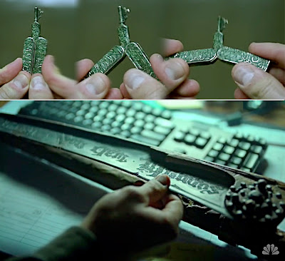
Concepts for the key shown above.  I thought either
the ideas of a maw opening to reveal the key, or perhaps
claws as the teeth of the key might look cool.
The most impressive thing is, that they work in a state of not knowing.. Let me try to explain..  There's so little time, that if someone's given a prop to start designing, they're simultaneously creating metaphors or a specific look or feel that no one really knows will fit yet?  Nor does the Prop Master know if that prop will be changed at any time during that day, or shoot or if it might be cut just after completion? (and no, "Cut After Completion" isn't a name I danced under =)  Perhaps this is the way all office situations work, but I found it fascinating!  Still don't know how they do it.? =)

Scythe blade (which actually sent the Props Master
in for stitches) started out a bit more proto-German
with animal symbols
The few things I contributed to Grimm were created in less than a week, and done alongside grading projects, and freelance.  I researched language, and mythology inasmuch was applicable, and as is the case for every project, I threw my back into getting them what they needed.  A macabre children's book feel, with some knowledge of Ancient scripts was what I was brought in for (I think), but needed changes in direction seemed to happen on the hour, along with script changes which unfortunately excluded most of the sketch work I did.  So, all the drawings you see in Grimm's pilot aren't mine, but I'm going to show you a couple of the things here that I thought were pretty good that we may see in future episodes.. =)  Stay tuned for Part II.. =)

Friday, July 29, 2011

Norman Rockwell

This is a tin that my birth Mum gave to me long ago. It's been the place that I keep many of my miniature things, like a small coin & stamp collection, little plastic toys and random bits of my life, past and present.. It was the first Rockwell I'd ever seen.. It was also the first painted illustration, where in that magical pre-digital moment, begged my young mind to determine whether it'was a photograph or not as well.. It remains on my desk as encouragement to strive for my next level of skill.. Last month, on encouragement from Vinod & Emily, Pam and I had the pleasure of viewing a Norman Rockwell exhibit in Tacoma,WA. Over forty original Rockwell paintings, Prints of the famous Freedom Posters, and every cover Rockwell did for the Saturday Evening Post. I'm so very glad we went the distance, as after seeing these masterworks, I can't rightly say that I'll experience anything quite like it again? I've talked to other ADs and Artists who've seen Rockwell originals, and we're all a bit overwhelmed by it, we all share in that common sense of observing something of Greatness..

In terms of Technique :: I simply can't cover it all? There were points at which Rockwell pushed my digital mind so far back into my unconscious, that I was actually able to recollect the reason why I got into this odd business of illustration. Scale was of course at the forefront of every experience, as they are enormous canvases. Even the tiny B&W newspaper ad I saw for a brake pad company was around 28in. wide, approximately the width of my full color cover work?? I remember
Donato Giancola saying at a convention how much painting larger changed his perception, and now I can see why.. The use of type painted right on the illustration has all but gone the way of the dinosaur, so to see experimentation, and serendipity within the same piece was amazing.. I'm convinced Rockwell's eyes saw nothing but light and color, and he painted so deliberately with that light, it made me jaw sink more than a couple times. (they didn't make me wear a drool cup, which was nice on the curators part.) I saw underpaintings that ranged from dark blues to what looked like diluted india ink red. Some paintings came up from a series of washes, where others were so caked on, wet-on-wet that it looked as though Rockwell was painting with a roller.. Through most of his metallic surfaces, you'd see his sketch, letting the slight graphite glare add to it's shine.
Although, more than anything else that stood out that day was Rockwell's use of textural relief.. There's really no describing this, and they wouldn't let me take pictures (even after I offered to wash their car) so let me say that this element gave each illustration a "museum" feel..?? In "Christmas Eve in Bethlehem" detailed above, there was canvas left just bare so that the head dress and army uniforms would feel more like cloth.. The rippling aura of the electric light is created with 1/4in. thick titanium white that's been carved with a pallet knife.. Makes it look like the light is actually shimmering.. It's not perceptible on any print or pic because of the scale, but in just about every painting, Rockwell backs up his surface with textural elements coinciding with the material at hand.. The bubbles that form around the finger tips of the boy and girl being dunked under water are about an 1/8 inch on top of the canvas.. In the famous painting of the wall in "The Problem We All Live With", that grout line has actual sand inclusions scraped into it, making the original canvas as stone like as actual stone..

In terms of Content :: Rockwell's humor is both as subtle and deliberate as is the case with his technique. With so many amazing portraits; simple, complex, expressionistic, anthropomorphic and stretched as far as they'd go before looking inhuman, it's hard to imagine the man ever being fooled by someone's intentions. I'm positive Rockwell was the kind of observer who'd of read your face within the first three seconds of meeting you.

Unlike the way I tend to direct attention quite blatantly with levels of detail when I'm composing a painting, Rockwell instead kept a similar level of detail (insane amounts) on everything around the focal point, not forcing your eye, but letting it come around to it eventually, and leaving the individual to find favored areas of the painting on their own.

Although I'd always thought Rockwell and his photographers, were known for a certain squeaky clean portrayal of a sort of dreamed up, unachievable America. It turns out that he was more a realist and protesting old curmudgeon than I expected! The story of philosopher Will Durant, and Rockwell's Four Freedoms paintings shows us that Rockwell even fought the Military establishments ideology, and in many ways taught us more about the philosophy of Peace, Tolerance and Unity, than simple reminiscence of youth, humor and patriotism... far more..

If you get a chance to visit the Rockwell Museum, or if the traveling show is in a nearby town, do yourself a favor and go experience these masterworks.. Stay Tuned !! =)

Labels: , , , ,

Tuesday, June 28, 2011

Fabled Earth

Fellow SF&F illustrators, stalworth animal rights advocates, and good friends Vinod Rams & Emily Fiegenschuh, have
not only moved out to the beautiful PNW, but Emily has brought a brand new art tutorial to the Sphere. From Fantasy Genesis' publisher Impact books, Emily has written and illustrated, The Explorer's Guide to Drawing Fantasy Creatures! I couldn't be happier for her, as Emily's work has always been brilliantly rendered traditionally in gouache, and by the looks of the book so far, her style has grown into one somewhat
reminiscent of the more detailed oil work of Patrick Woodruffe. With a number of years illustrating for D&D, Children's and Tween's series from Mirror Stone, I'm sure there is a ton to learn from in this tutorial, so by all means step to following Emily's Blog
Fabled Earth for updates and releases, and more importantly get your mitts on this brand new book, Explorer's Guide to Drawing Fantasy Creatures!
Stay tuned !! =)

Saturday, April 16, 2011

First Stumptown ComicCon

I sing the pile of Stumptown swag.. It was a plentiful pile, a pile the funky likes what I've nae seen.. =) What a fun show that is! Small but fun.. Probably wouldn't want it to be much bigger, as all the Indy Comic weirdness that only Portland can offer might begin to slip.? Met up with fellow LightPushers; Craig Spearing, Patricia Smith aka SmugBug and Ko Attenbury, and met more than a couple more comic artists and writers. Comic artist Brett Weldele was nice enough to spend some time chatting about his process and meeting Joy Ang was a nice surprise to finish off the show! Gotta free Mignola mask, saw a couple of my students, and bought a print of Zombie Spock.. Live long, and BRAINS!!! Stay tuned.. =)

Wednesday, March 30, 2011

The Continuing Magic of the Kells


Pam and I saw the most brilliant animated feature the other night.. The Secret of Kells.. I think I'm late to the party on the film, but it spoke to me in some rather interpersonal ways.. So much so, that there's no explaining them all.. Something like Samurai Jack it was wonderfully 2d and linear in technique, looking much like the animation of the 50's and 60's, but in terms of content it was simply an Illustrators movie.. Illumination, Traditional alchemy of mordant Ink and parchment, the fight between administrative causes and creative spirit, the bond between Mythology Religion and Art, Knot work the likes of Kells and Durrow.. and the very definition of the root of Illustration.. Illustrare :: Bringing that which is darkness into Light! These are pieces of illustration history that have sparked off a lifelong fire in more than just this illustrator, and for good reason.. My last year of school, and the following five, were spent studying Celtic book illumination and Craft, knot work and the similarities to fractal chaos.. It was also the inspiration for many of the books and typography of Morris' Kelmscott Press, much of Jim Fitzpatrick's work and countless other creatives throughout history.. I wept when I saw the Kelmscott Chauser for the first time, and I don't doubt this is the very reason why Trinity College keeps the Book of Kells under glass, lest some idiot like myself unwittingly moisten it's pages.. =)
The accents and mannerisms also brought back memories and smiles for my surrogate Family the Koras, and Nan Tulips, with her beautiful Scottish brogue!! My blood family is partially British/Scotts but here were the mysterious accents of my youth popping off, right alongside my artistic sensibilities in a mixing that at times brought an Ancient shiver up my spine.. One scene was particularly so.. Where the keeper of the Forest, frees the hero from his uncles lock & key with the help of a tiny spell upon a white cat.. Pangur Ban..
On further study of the lyrics, I found that this sequence was a take on a piece of history.. Pangur Ban or White Cat was the title of a tiny poem written by an ancient Irish monk, bored of transcription, and watching the abbey cat hunt mice.. The poem was written in Gaelic, not Latin, in the margins of a massive illuminated page.!! Ancient, linguistic disobedience and multi-culturalism at play without anyone knowing for years.. =) Don't really think I can love that enough.. =)
Well Folks, keep a look out for my Update Mailer sometime this week, and stay tuned !!

Labels: , , ,

Wednesday, January 05, 2011

Congratulations Raffle Winner :: Dan Kelly

The list was amassed, dice were rolled, the winner was contacted, and one of my charities was picked for me to give to!  This quarter my prize for signing up to my mailing list and blog, goes to someone across the pond; Mr. Dan Kelly!  Thanks Dan for following my illustration career, and picking the environmental protection group, Defenders of Wildlife as being worthy of a small contribution in 2010!  You'll receive a print of my Werewolf, in honor of the hundreds of Gray Wolves recently put in jeopardy by short sited Republican influence and ranching lobbyists.. Taking the less than 2500 Yosemite Grays off the endangered species list after 30 years of protection is just short of genocide, when you conceder what little needs to be done to coexist throughout the mountainous regions of the West.  Dan will receive a signed and sketched collectible Magic the Gathering whiteback card as well, and I can't thank each of you who've signed up for my mailing list enough as we enter this new year !!  Tell your friends and family that they too can be eligible for free raffle prints and collectables, and I'll keep on picking winners!!  Stay Tuned.. =)

Thursday, December 16, 2010

First class Class

Here I am at the end of my first semester teaching at the PNCA, and I sigh with an air of guarded fulfillment.  I taught a materials class with an aim towards illustration, Experiments in Drawing for the Illustrator.  Such a bizarre cacophony of content, materials and technique crammed into a couple of months, and simply entering back into the college atmosphere has been a baptism of fire to say the least.  
I would've never expected some of the mistiming and thinly spread states of fatigue over the semester, but the great group of focused students I had the pleasure of guiding for a short while, came over as unexpectedly as the Portland Sun on my face before the end of class today.

Fantasy Genesis played a roll as well, with an extra credit assignment.  I gave them the same roll that was used for the Cosmic Dragon to spring from, and here's a couple results coming from; Danny Frasier (a very focused junior with an eye towards editorial and expressive inks), and Sara Stanton (like many of my students, coming somewhat from both the worlds of Miyazaki and the Portland Comic scene I'm still discovering) Take a look at these offerings, and hopefully there will be a couple more to show before too long..  Stay tuned.. =)

Wednesday, October 20, 2010

My first Roller Derby

This was something I've wanted to do for a long time, but to be honest was always kinda as scared of it as deregulated speculative lending and investments.. I finally bit the bullet though, on a recent date to meet the best friend of my new girlfriend..  I've visited countless photostreams and sites for Derby when looking up reference for SF&F female warrior characters, but this time I was taking my own, baby boi..  and I brought my journal to sketch in, but forgot my pencil..!?!  Can you believe that..??
Unfortunately, as you can tell, they're horrible shots.. and our team lost, (inasmuch as I could gather from what the board and campy announcer told me) but I've got some technique down, it was a TON of fun in something like a high school gym atmosphere I wouldn't want getting too much bigger than, or it would lose it's brilliant Pabst Blue Ribbon appeal..

These beauties, with names like "Viagra Falls", and "Ilea (eat your) Babies" had a lot of heart and passion for the game, I'd suggest anyone in the Portland area check your Rose City Rollers out, and maybe we'll get a nice clean hip check shot for next time around..  Stay tuned.. =)